No single metric tells the whole story. Use the measures that match the visual task, then confirm the result in the real application.
Terms such as CRI, R9, Rf, Rg and TLCI help designers, engineers and specifiers understand aspects of colour performance that lumens and Kelvin cannot explain. No single metric tells the whole story, but used together, they provide a far clearer picture of how a lighting solution will perform in the real world.
What do we mean by light quality?
Light quality is broader than brightness or energy efficiency. It describes how effectively light supports the people, objects and activities within a space.
It can include:
- How naturally and accurately colours are reproduced
- Whether colours appear muted, vivid or oversaturated
- How consistent the light appears from one luminaire to another
- Visual comfort, glare and flicker
- Light distribution and uniformity
- The way light interacts with materials, products, skin tones and cameras
This article focuses specifically on the colour-rendering aspect of light quality.
Colour temperature does not tell us colour quality
Correlated colour temperature, or CCT, describes whether white light appears warm, neutral or cool. It is measured in Kelvin, using familiar values such as 3000K or 4000K.
CCT does not tell us how well that light will reveal colour.
Two luminaires can both be rated at 4000K while producing very different results on red fabrics, fresh food, artwork or skin tones. Their white light may appear similar at first glance, but the balance of wavelengths within that light can differ considerably. This is why a complete specification must look beyond Kelvin and lumens.
Colour fidelity and colour preference are not the same
One of the most useful distinctions in light-quality design is the difference between colour fidelity and colour preference.
Colour fidelity
Colour fidelity describes how closely colours under a test light source match their appearance under a suitable reference illuminant of the same colour temperature.
High fidelity is important when colours must remain accurate and consistent. Examples include museums, paint and material evaluation, healthcare, quality-control areas, fashion retail and other environments where small colour differences matter.
Colour preference
Colour preference describes whether people find the colour appearance attractive or desirable.
The most preferred appearance is not always the most technically accurate. In a fresh-food display, for example, a carefully controlled increase in colour saturation may make produce appear more vibrant and appealing. In hospitality, warmer and richer colour may support the intended atmosphere.
This does not mean that more saturation is always better. Excessive colour enhancement can make products appear unnatural or misleading. The correct balance depends on the application and the experience the lighting is meant to create.

CRI: the familiar starting point
The Colour Rendering Index, commonly called CRI, is the best-known colour-rendering metric. Its general value, Ra, compares a test light source with a reference and reports the average result across eight relatively muted test colours.
A higher CRI Ra generally indicates that colours will be rendered more faithfully. It remains a useful, widely understood specification tool and a practical starting point when comparing light sources.
However, CRI has limitations:
- The Ra value averages only eight test colours.
- Those colours do not represent every material or hue encountered in real spaces.
- Strong saturated colours are not included in the general Ra average.
- A single average can conceal weak performance in a particular colour.
- The score indicates the degree of difference from a reference, but not always the direction of the shift.
Two light sources with the same CRI can therefore render particular colours differently.
Why R9 matters
R9 is one of the additional special CRI values and represents the rendering of saturated red. It is not included in the general CRI Ra average.
Red performance matters because red is present in many visually important subjects, including:
- Skin tones
- Meat, fruit and prepared food
- Timber and warm interior finishes
- Clothing, cosmetics and branded merchandise
- Artwork and printed materials
- Clinical observation, where the applicable professional standards must also be considered
A luminaire can achieve an acceptable general CRI while still having weak R9 performance. For applications where reds, warm materials or skin tones are important, asking only for the CRI Ra value leaves an important gap in the specification.
R9 should not be treated as a complete quality score on its own, but it is a valuable companion to CRI.
 Figure 3. Conceptual comparison of the breadth of the CRI Ra and TM-30 sample sets. The coloured swatches are illustrative, not reproductions of the standards’ actual samples.
TM-30: a more complete view of colour rendition
TM-30 was developed to provide a more detailed and statistically robust assessment of colour rendition. The current edition, ANSI/IES TM-30-24, evaluates a light source using 99 colour-evaluation samples rather than the eight samples used for the general CRI Ra calculation.
Its two best-known headline metrics are Rf and Rg.
Rf: colour fidelity
Rf indicates how closely the test source reproduces the reference colours across the larger set of samples.
Like CRI, a higher value represents greater average fidelity. Because it uses more samples and a modern calculation method, Rf provides a broader assessment of how a source performs across different colours.
CRI Ra and TM-30 Rf are not interchangeable scores. A product specification should always identify which method produced the stated value.
Rg: colour gamut
Rg describes the average area of colour gamut under the test source compared with the reference.
- An Rg around 100 indicates a similar average gamut to the reference.
- An Rg above 100 generally indicates increased average saturation.
- An Rg below 100 generally indicates reduced average saturation.
A higher Rg is not automatically better. The right value depends on whether the project requires strict colour accuracy, a more vivid appearance or a carefully balanced result.
The colour-vector graphic
One of TM-30’s greatest advantages is that it can show how different groups of colours are affected. Its colour-vector graphic reveals where hues may become more or less saturated and where hue shifts may occur.
This matters because two light sources can have similar headline Rf and Rg values while behaving differently in a specific part of the colour spectrum. For a fashion retailer, art gallery or food display, that detailed information can be more useful than a single average score.
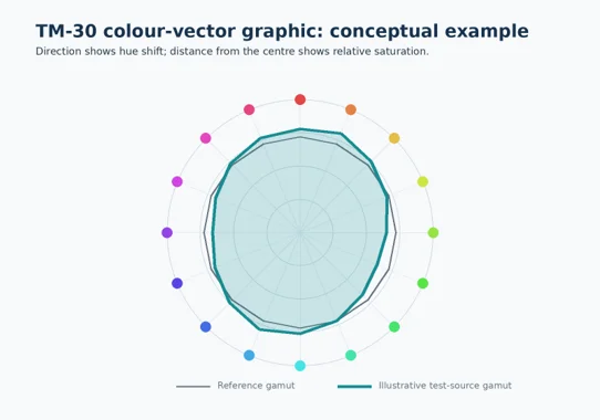 Figure 4. Conceptual colour-vector graphic showing how hue direction and relative saturation can be visualised. This is not measured product data.
What about the CIE colour fidelity index?
CIE 224:2017 defines a scientific colour fidelity index, also called Rf, using 99 test-colour samples and an updated colour-difference method.
It improves the scientific assessment of fidelity, particularly for solid-state light sources. However, the CIE itself makes an important point: fidelity is only one aspect of colour quality. It does not, by itself, measure preference, vividness or the suitability of the light for a particular task.
Whenever Rf is quoted, the relevant standard or calculation method should be stated so that values are interpreted correctly.
TLCI: when the camera is the observer
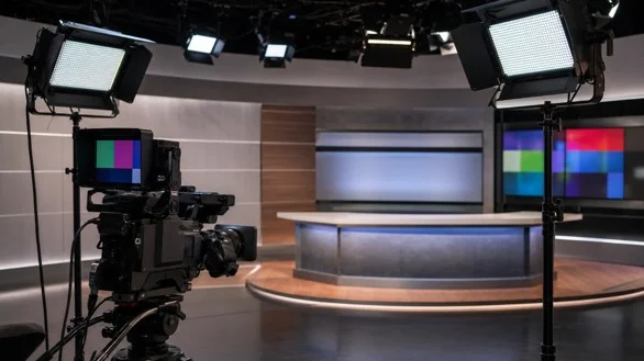
Human eyes and television cameras do not respond to light in exactly the same way. A source that looks acceptable in person may still produce colour shifts on camera and require substantial correction in post-production.
The Television Lighting Consistency Index, or TLCI, assesses how a light source is likely to perform for television-camera capture. It is especially relevant to:
- Broadcast studios
- Sports stadiums and arenas
- Event and stage lighting
- Content-production spaces
- Environments designed for regular video recording
For these applications, a high CRI alone is not enough. TLCI, camera testing and the complete production workflow should be considered.
Other colour metrics you may encounter
Technical product data may also refer to metrics such as the Gamut Area Index (GAI), Color Quality Scale (CQS) or Feeling of Contrast Index (FCI).
These systems examine different combinations of fidelity, gamut, contrast or preference. They can provide useful specialist information, but they are less commonly used in everyday project specifications than CRI, R9 and TM-30.
The key is not to collect as many numbers as possible. It is to select the metrics that answer the visual question posed by the application.
A practical guide to choosing the right metrics
| Application | Primary colour-quality need | Metrics and checks to consider |
|---|---|---|
| Museums, galleries and material evaluation | Faithful colour with minimal distortion | CRI Ra, Rf, hue-specific information, spectral review and physical mock-ups |
| Fashion, cosmetics and premium retail | Accurate products, fabrics and skin tones | CRI Ra, R9, TM-30 Rf and Rg, colour-vector graphic and in-store trials |
| Fresh food and grocery displays | Appealing but credible colour | R9, Rg, hue-specific shifts and a mock-up using the actual products |
| Offices, education and general commercial spaces | Balanced colour and long-term visual comfort | Appropriate CRI or Rf together with glare, flicker, distribution and consistency |
| Industrial inspection and quality control | Reliable identification of materials and colour differences | High fidelity, application-relevant special indices, consistency and task testing |
| Healthcare | Clear visual information and dependable skin-tone rendering | CRI Ra, R9, Rf and all applicable clinical or regulatory requirements |
| Broadcast, stadium and content production | Consistent colour on camera | TLCI, camera tests, spectral data and production-specific requirements |
These are starting points rather than universal specifications. The required values should be selected around the task, materials, users and governing standards of each project.
How to specify light quality more intelligently
- Begin with the visual taskAsk what the lighting must achieve. Is the priority faithful colour, visual appeal, accurate inspection, camera performance or a combination of these?
- Request more than one headline valueCRI Ra may be sufficient for some general applications, but colour-critical projects should also consider R9, TM-30 data or other relevant measures.
- Review the complete product dataLook at the colour temperature, colour consistency, spectral information, output, optics, glare control, flicker performance and expected operating conditions. A good colour score cannot compensate for poor visual comfort or unsuitable light distribution.
- Test the actual applicationMetrics help narrow the options, but they do not replace a physical mock-up. Test the proposed light on the real finishes, products, artwork, work surfaces or cameras whenever colour is commercially or operationally important.
- Maintain quality across the installationThe selected colour performance must remain consistent across batches, luminaires and time. Product engineering, thermal management, component selection, binning and quality control all influence the final result.
Better metrics lead to better lighting decisions

Light quality cannot be reduced to one number.
CRI remains a useful starting point, but R9 reveals important red performance, TM-30 provides a fuller view of fidelity and gamut, and TLCI evaluates the needs of cameras. The correct combination depends on what the light must reveal, enhance or communicate.
At LED Lighting SA, our lighting design, engineering and manufacturing teams consider colour quality as part of the complete lighting solution. We evaluate how light interacts with the architecture, products, materials and people within a space, alongside illuminance, distribution, efficiency, controls and visual comfort.
Because the best lighting is not simply bright or efficient. It allows every environment to look, feel and perform as intended.
Speak to the LED Lighting SA team about selecting the right colour-quality performance for your next retail, commercial, industrial, hospitality, healthcare, transport or specialist lighting project.